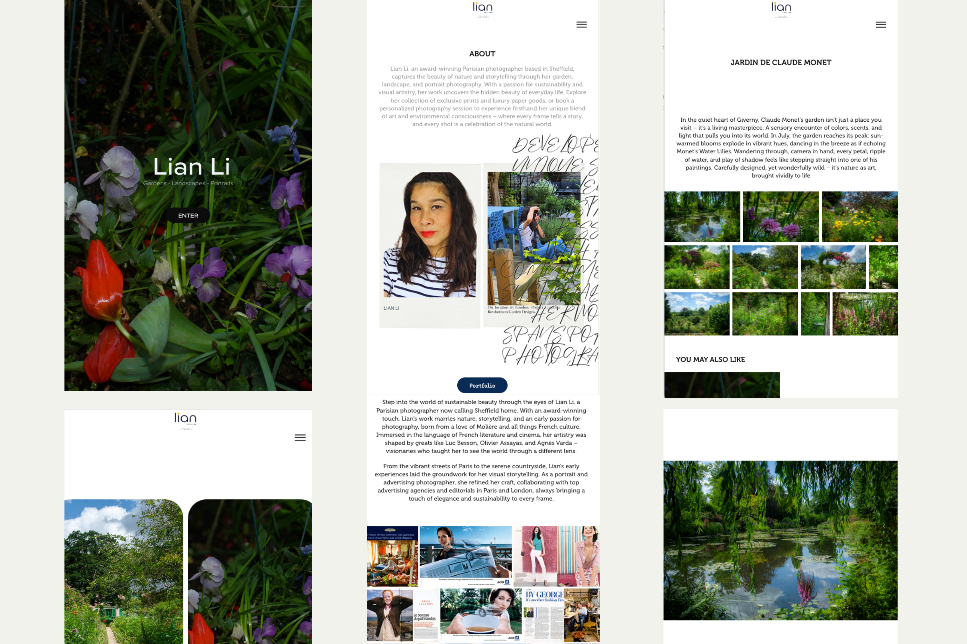
Short looping studio video of Lian Li coding.

Mobile-first websites that make complex offerings obvious

I design and build mobile-first websites with clear structure and visual hierarchy, then validate the experience with real users.


My role in this project

I led the project end-to-end: defining the structure, designing the interface, building the front-end, and validating the experience with usability testing.

  • UX: information architecture and navigation structure
  • UI: layout, typography, colour system, and components
  • Build: HTML, Tailwind CSS, JavaScript, and GitHub Pages deployment
  • Validation: usability testing with five participants
  • SEO: technical SEO, metadata, and AI-search optimisation

The What

This self-initiated UI/UX case study documents the redesign of my portfolio website, approaching the site itself as a UX problem: how to clearly present two related disciplines, web design and photography, without confusing visitors. The redesign focuses on mobile-first structure, clearer information architecture, and a more intuitive client journey.

A redesign and rebuild of my professional website to support clear positioning as a web designer, with photography integrated as a secondary, supporting discipline.

Project Summary

Project
L by Lian — website redesign
Focus
Clarifying a dual offering: web design first, photography second
Role
UX, UI, information architecture, visual direction and front-end build
Tools
Figma, HTML, Tailwind CSS
Outcome
A clearer portfolio structure with web design as the primary client path and photography supporting the visual identity.

The Why

Adobe Portfolio was built primarily for photography, which made it difficult to present my mobile-first web design work in a clear and intentional way. To show my website designs properly, I had to create a separate site, and template constraints meant the final result did not reflect how I wanted the work to be experienced. The process was inefficient, and the visual outcome fell short of what I expect from my own work.

The How

I designed and built a custom static site with full control over layout, hierarchy, and navigation, organising the work around case studies rather than pages to support long-term clarity and growth.

Before

The previous site was built on Adobe Portfolio at a time when photography was my primary focus. As my work expanded into UI/UX and web design, the platform’s template-led structure limited my ability to clearly position and prioritise both services.

With an increasing number of projects, it became difficult to design clear, scannable case studies. Navigation, hierarchy, and flow could not be properly expressed without access to code, resulting in a site that required explanation rather than allowing visitors to intuitively understand the work.

Screenshot of the previous photography portfolio built with Adobe Portfolio.
Old photography portfolio
Screenshot of the previous mobile-first web design portfolio built with Adobe Portfolio.
Old mobile-first web design portfolio
Showing both web design and photography required two separate websites, which made it harder to clearly communicate what I do and resulted in a less intuitive experience.

Structure & navigation decisions

The strongest decision in this project was separating two disciplines while keeping the experience cohesive.

Figma sitemap diagram showing the site navigation hierarchy and user paths across Home, UI/UX Web Design, Photography, Shop, About, and Contact.

Outcome: primary web-design route, separate photography section, simplified mobile navigation.

This sitemap shows how the site is organised so visitors can find things fast.

Style guide

A single style board to keep type, colour, and components consistent.

Figma style guide board showing typography, colour palette, iconography, and button styles.

Screens

Screens that prove hierarchy: primary path, secondary exploration, optional depth.

Let’s work together

Make it obvious. Make it beautiful.

Mobile-first. Clear hierarchy. Visual impact.

Designed + built by me • validated with 5 users

Build & QA

How I planned, built, and verified the site.

Design and build process

I started with hand-sketched wireframes to plan layout and navigation, then moved into Figma to create a moodboard for visual direction, low-fidelity wireframes, and a site map. From there, I built the site in code and iterated as I tested and refined the design.

I also use Copilot to speed up troubleshooting and spot mistakes while I’m working. I still make the final calls on what ships, and I click through the site to confirm everything behaves correctly across real screen sizes.

Tools: Figma, HTML/CSS, Tailwind, JavaScript, GitHub Pages.

In short: wireframes → Figma → build in code → iterate → verify.

What I checked

  • • Mobile and desktop layout behavior.
  • • Menu open/close and keyboard focus states.
  • • Links, image loading, and console errors.
  • • Lightbox open/close (Esc and overlay click).
  • • Accessibility basics (contrast, focus visibility, reduced motion).

Accessibility

  • • Keyboard support (menu + lightbox) and visible focus states.
  • • Contrast checks and predictable labels/navigation.
  • • Reduced motion-friendly interactions.

Results

Early results based on usability testing and direct feedback (no analytics baseline yet).

Clear first impression

People understood what I do within 5–10 seconds.

Self-navigation

Users found Web Design work and Contact without guidance.

Mobile clarity

Simplified labels and clearer cues reduced hesitation on mobile.

Summary: The redesigned structure makes the service offering immediately clear and allows visitors to find key pages without guidance.

This UX case study documents a portfolio website redesign focused on mobile-first structure, clearer information architecture, and better positioning of web design as the primary service. The main challenge was presenting web design and photography together without confusing visitors.

Validation

I tested the site with 5 people (ages 35–60) to check whether the structure and navigation felt easy to use, especially on mobile.

What I tested

  • • “Can you tell what I do in 5–10 seconds?”
  • • “Where would you click to view web design work?”
  • • “Where would you go if you wanted photography?”
  • • “Can you find Contact without scrolling forever?”
  • • “Does the navigation feel obvious on mobile?”

Sample: 5 participants, ages 35–60.

What changed after testing

  • • Changed some UI navigation dots to arrows for clearer direction.
  • • Simplified labels to reduce hesitation.
  • • Reduced competing CTAs so the next step is clearer.
  • • Adjusted mobile spacing so scanning stays easy.

Result

Testers described the site as very intuitive and were able to self-navigate without guidance.

Constraints

Constraints are evidence. They explain why decisions were necessary, and why the solution feels earned.

Project constraints

  • • One-person project (strategy, design, build, QA)
  • • Needed full layout control (Adobe Portfolio couldn’t offer it)
  • • Photography needed integrity (not reduced to “decor”)
  • • Tone needed to feel client-ready, not overly salesy

Design constraints

  • • Users scan fast; navigation must explain itself
  • • Dual offering must coexist without friction
  • • Mobile-first: reduce effort and avoid dense layouts
  • • Keep labels predictable to reduce “where am I?” moments

Explore More

Related Work

About the author

Lian Li is a UX/UI designer and garden photographer working under the name L by Lian. She designs mobile-first websites with clear structure, thoughtful visual hierarchy, and strong image direction.